So you’ve been watching Bitcoin go up and down like a roller coaster. One day you hear, “Buy now, it’s cheap!” The next day someone yells, “Sell, it’s too high!” Your head spins. You wonder, “How do these guys even know?”
Well, many of them use a simple tool called the Bitcoin Rainbow Chart. And once you learn how to read it, you’ll feel like you have a cheat sheet for Bitcoin’s price game.
Sit back. Let’s chat about this colorful little chart that has helped folks dodge bad buys and lock in smart ones for years.
What Is the Bitcoin Rainbow Chart?
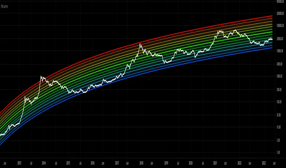
Picture a chart with rainbow stripes from bottom to top. Each color tells you something about Bitcoin’s price. Cool blue at the bottom means cheap. Hot red at the top means risky. The price line moves through these colors over time.
That’s it. That’s the Bitcoin Rainbow Chart in one breath.
A guy named Trolololo first posted this chart on a Bitcoin forum way back in 2014. It started as a half joke. But over the years, people noticed something wild. The chart actually worked. Bitcoin’s price kept moving in step with those colorful bands. So traders started taking it seriously.
Today, the Rainbow Chart is one of the most loved tools for long term Bitcoin holders. It’s not perfect. No tool is. But it gives you a quick way to feel if Bitcoin is cheap, fair, or too hot to touch.
If you’re still new to Bitcoin and want a quick brush up before diving deeper, our beginner’s guide to Bitcoin is the perfect starting point.
Why Does the Rainbow Chart Even Work?
Good question. How can a colorful chart predict anything?
Here’s the trick. The Rainbow Chart uses something called a logarithmic regression. Sounds fancy, right? In plain words, it just means the chart smooths out Bitcoin’s long term price growth into a curve. Then it adds color bands around that curve.
Why does this work? Because Bitcoin tends to follow boom and bust cycles. Every four years or so, it shoots up, peaks, crashes, and slowly climbs back up. The pattern keeps repeating. The Rainbow Chart catches this rhythm.
When the price drifts into cold blue zones, history says it’s a good time to buy. When it pushes into hot red zones, history says watch out, a crash might be near.
But hold up. The chart doesn’t promise anything. It just shows you what tends to happen. Smart folks use it as one piece of the puzzle, not the whole answer.
How to Read the Bitcoin Rainbow Chart
Okay, let’s get to the fun part. How do you actually read this thing?
The chart has nine color bands. Each one means something. Let’s walk through them from bottom to top.
Dark Blue: “Fire Sale”
When the price hits this zone, Bitcoin is super cheap by historical standards. Like Black Friday for crypto. Big sale, everyone runs away. But brave buyers who jump in here often see huge gains later.
Light Blue: “BUY!”
Still cheap. Most long term holders see this as a strong buy zone. Prices here have led to big upside moves in past cycles.
Cyan: “Accumulate”
This is where smart buyers slowly stack Bitcoin. Not a steal, but still a solid deal. You aren’t paying top dollar.
Green: “Still Cheap”
Bitcoin is at a fair price here. Not a bargain, but not too pricey either. A good zone for steady buying.
Light Green: “HODL!”
Hold tight. The price has moved up a bit, but it’s still in healthy territory. If you bought lower, sit on your hands and let it ride.
Yellow: “Is This a Bubble?”
Things are heating up. Prices are rising fast. New buyers are pouring in. Some folks start asking, “Is this too good to be true?”
Light Orange: “FOMO Intensifies”
FOMO means fear of missing out. People panic buy at these levels. Everyone wants in. Your aunt starts asking how to buy Bitcoin. Watch out.
Orange: “Sell. Seriously, SELL!”
The market is on fire. Profits look huge. But this is often when smart money starts selling. If you bought low, this is a great spot to take some profits off the table.
Red: “Maximum Bubble Territory”
The danger zone. Crash risk is high. Hype is at peak levels. History shows that buying here is a really bad idea. Many folks lose big money chasing the top in this band.
Easy, right? Just look at the chart. See what color Bitcoin’s price is sitting on. That tells you the mood of the market.
Open the Live Bitcoin Rainbow Chart Now
How to Use the Rainbow Chart for Your Trades
So now you know the colors. But how do you actually use this thing to make smart choices?
Let me share four simple ways folks use the Rainbow Chart in real life.
1. Buying in Blue Zones
When Bitcoin sits in the blue or green bands, that’s your green light to buy. Prices in these zones have rewarded buyers handsomely over time. Just remember, the chart can stay in cold zones for months. So don’t rush. Spread your buys over weeks.
2. Holding in Yellow and Light Green
When the price climbs into the middle bands, you don’t need to do much. Just sit tight. Don’t panic sell. Don’t FOMO buy more. Let your earlier buys grow.
3. Selling in Hot Zones
When Bitcoin hits orange or red, that’s often a sign to take some profits. Not all of your Bitcoin. Just a piece. Maybe 20% or 30%. This lets you cash in on gains without missing future upside.
4. Long Term Planning
Big Bitcoin investors use the Rainbow Chart for cycle planning. They buy heavy in blue zones. They sell pieces in hot zones. Then they wait for the next blue zone to load up again. Rinse and repeat. Over the years, this strategy has worked really well for patient folks.
The chart pairs well with halving cycles too. Want to know more about how halvings drive these moves? Check out our Bitcoin halving guide. It explains why prices often shift around halving events.
What the Rainbow Chart Won’t Tell You
Now let’s keep it real. The Rainbow Chart is helpful, but it’s not magic. Here’s what it can’t do.
It can’t predict short term moves. The chart is built for long term cycles. Daily or weekly moves? It won’t help much there. If you want to day trade, this chart is not your friend.
It can’t promise gains. Past results don’t guarantee future ones. Bitcoin could break out of its old patterns. New tech, new rules, or huge global events could change everything.
It can’t fix bad habits. If you keep panic selling at the bottom and FOMO buying at the top, no chart will save you. Discipline matters more than any tool.
It can’t replace your own thinking. The chart is just one input. You still have to check news, watch other indicators, and trust your gut sometimes.
So use the chart as a guide. Not a crystal ball.
Why the Rainbow Chart Is Great for Beginners
Now here’s the cool part. The Rainbow Chart is super beginner friendly. You don’t need to be a math whiz to use it. You don’t need fancy software. You just look at the colors and make smart calls.
Most other crypto indicators feel like alien language. RSI. MACD. Bollinger Bands. Yikes. But the Rainbow Chart? Anyone can get it in two minutes flat.
This makes it perfect for new crypto folks who want a simple way to time their buys without getting buried in charts and numbers.
Plus, it teaches patience. Bitcoin moves slowly through these color bands. So the chart helps you think long term. It pulls you away from the daily noise. That’s huge when you’re starting out.
Common Mistakes People Make With the Rainbow Chart
Let’s chat about some classic mess ups. Don’t be the person who makes these.
Mistake 1: Only checking the chart at peaks. A lot of people only look at the Rainbow Chart when Bitcoin is shooting up. They see orange or red and panic. Then they don’t check it again for months. To use it well, check it often during all phases.
Mistake 2: Ignoring other signals. The Rainbow Chart is a great tool, but not the only one. Combine it with on chain data, news, and macro events. A balanced view always beats a single source.
Mistake 3: Going all in based on the chart. Some folks see a blue zone and dump their life savings into Bitcoin. Bad idea. The chart can stay blue for a long time. Always spread your buys over time. Never bet the farm on one signal.
Mistake 4: Selling everything in red. Just because Bitcoin hits red doesn’t mean you should sell every coin you own. Take some profits, sure. But keep a core position. Bitcoin has surprised many sellers by going even higher from red zones in past cycles.
Mistake 5: Forgetting the chart adjusts over time. The Rainbow Chart updates as Bitcoin grows. The bands aren’t fixed forever. They shift slowly to match Bitcoin’s long term growth. So always look at the latest chart, not screenshots from years ago.
How Does the Rainbow Chart Compare to Other Tools?
You might wonder, “Are there better tools out there?”
Let me give you a quick run down.
Stock to Flow Model: Tracks Bitcoin’s scarcity over time. Works well for long term moves but has missed recent price action.
Mayer Multiple: Looks at Bitcoin’s price compared to its 200 day moving average. Quick way to spot overbought or oversold zones.
RSI (Relative Strength Index): Shows if Bitcoin is overbought or oversold in the short term. More useful for traders than long term holders.
Pi Cycle Top: Tries to call market tops by tracking two moving averages. Has nailed past tops, but not foolproof.
The Rainbow Chart stands out because it’s the easiest to read. You don’t need to crunch numbers. You just check the color. For folks who hate complex charts, this is gold.
For more detailed market data and other indicators worth exploring, check out LookIntoBitcoin’s chart library. They host a ton of free Bitcoin tools that pair nicely with the Rainbow Chart.
Should You Trust the Rainbow Chart?
Here’s the honest answer. Trust it as one tool among many. Don’t bet everything on it.
The chart has nailed several past cycles. Buy zones in 2015, 2018, and 2022 turned out to be great entry points. Sell zones in late 2013, 2017, and 2021 helped many folks dodge huge losses.
But Bitcoin is changing. More big firms hold it now. Spot ETFs have changed how money flows in. So the old patterns might not repeat exactly. Always stay open to the chance that this time is different.
The smart play? Use the Rainbow Chart as a check. Combine it with mining cycle data, halving timing, and overall market mood. If you want to learn more about mining and how it ties into price cycles, our mining guide covers the basics nicely.
Pro Tips for Using the Rainbow Chart
Want to level up? Here are some tricks pros use that beginners often miss.
Tip 1: Use it monthly, not daily. The chart is built for long term moves. Checking it every day will just stress you out. Look at it once a month. Make calm choices based on the bigger picture.
Tip 2: Pair it with DCA. DCA means dollar cost averaging. You buy a fixed amount each week or month. When the chart shows blue, buy a little more. When it shows red, buy less or skip. This blends well with the Rainbow Chart’s logic.
Tip 3: Set color based alerts. Some apps let you set alerts when Bitcoin enters new bands. This way, you don’t have to babysit the chart. You get pinged when it matters.
Tip 4: Zoom out often. Don’t just look at the past year. Zoom out to see all of Bitcoin’s history. The full picture tells you so much more than a recent slice.
Tip 5: Stick to your plan. Decide ahead of time what you’ll do in each color zone. Then follow that plan. Emotions kill returns. A plan saves them.
What the Future Holds for the Rainbow Chart
Will the Rainbow Chart still work in five years? Ten years?
Honestly, nobody knows. Bitcoin keeps growing in new ways. Big banks are getting in. Countries are getting in. The whole crypto world is shifting.
What we do know is this. Bitcoin still follows cycles. The Rainbow Chart still tracks those cycles. So even if the bands shift over time, the basic idea of buying in cold zones and trimming in hot zones will likely keep working.
The key is to stay flexible. Don’t treat the chart like gospel. Treat it like a wise friend who’s been around the block. Listen, but think for yourself.
Wrapping It Up
So now you know how to read the Bitcoin Rainbow Chart like a pro. It’s a simple, colorful way to feel out where Bitcoin sits in its long term cycle. Blue zones mean buy. Red zones mean caution. Everything in between tells you to hold, accumulate, or take some profits.
The chart isn’t perfect. It won’t predict every move. But it gives you a clear way to think about Bitcoin’s price without losing your mind to daily noise.
Use it. Test it. Combine it with other tools. And most of all, stay patient. Bitcoin rewards those who wait. The Rainbow Chart just helps you see when the wait is worth it.
Welcome to smarter Bitcoin watching. You now have a tool most people don’t even know about. Use it well.
Disclaimer
The content of this article is for informational purposes only. It is not financial, investment, or legal advice. Cryptocurrency prices are volatile and carry risk. Always do your own research and talk to a qualified expert before you make any investment choices. vCryptoCoin does not take responsibility for any losses that may occur from acting on the information in this article.
Frequently Asked Questions
Is the Bitcoin Rainbow Chart accurate?
The Rainbow Chart has been right about many past cycles. Buy zones and sell zones often lined up with real market moves. But it’s not 100% accurate. Bitcoin can break its old patterns. Use the chart as one tool, not the only one.
Who created the Bitcoin Rainbow Chart?
A user named Trolololo first posted the chart on a Bitcoin forum back in 2014. It started as a fun visual but caught on because it kept matching real price moves. Many sites now host their own versions of the chart.
Can I use the Rainbow Chart for other coins?
The original chart is built for Bitcoin only. But some folks have made similar charts for Ethereum, Solana, and other big coins. The idea works best for coins with a long price history and clear cycles. For new coins, the chart isn’t very useful.
How often does the Rainbow Chart update?
The chart updates live as Bitcoin’s price moves. The color bands themselves also shift slowly over time as more price data is added. So always look at the latest version, not old screenshots.
Should I buy Bitcoin when the chart shows blue?
Blue zones have been great buy spots in past cycles. But don’t dump everything in at once. Spread your buys over a few weeks or months. Markets can stay blue for a long time. Patience pays off when using the Rainbow Chart.